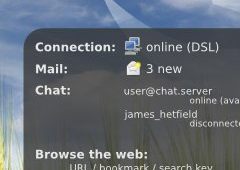
GNOME 3.0 Mockup: "May-B"
There's an interesting mockup of GNOME 3 over on GNOME-Look.org that someone did:
The mockup looks like a combination of Gimmie, (U)SLAB, and Mathusalem (elements which should probably be merged into GNOME sooner or later.) The tags/files panel on the right looks it could use some work (layout, size, fonts, etc.), but the overall concept seems like it's pointed in the right direction.
On a related note, the new DesktopThoughts blog (who's author created the mockup) aims at discussing ideas for "the next desktop". If you're interested in seeing what people come up with or you've got some ideas of your own, be sure to give it a visit.
Now, we just need to make sure that the GNOME logo doesn't evolve into some scary, evil-looking thing like the one in the background of that desktop...

2 comments:
thank you nice sharing
cep programsymbian programnokia programhtml kodlarıbedava cep oyunlarıcilt bakımı
Other ways to unlock trapped cash thomas sabo is in the form of selling thomas sabo shop silverware, silver flatware, sterling silver thomas sabo jewellery and scrap silver.
Post a Comment